
There’s that old, old, ancient saying, “Don’t judge a book by its cover.” We’ve all heard it a gagillion times (yes I know that’s not a real word but I just like it). Let’s be honest with ourselves, okay? I’ll admit it. I judge books by their covers and i know I’m not alone. That’s why they’re so important, right?
So for funsies, in between final edits, I’ve been playing around with imaginary covers for my novel Hooligans in Shining Armour. I’m not sure which publishing route I’ll go when I’m 100% ready to put it out there, but it was just fun to do! One cover is more based on Fiona’s story, the other is based on Danny’s.
Here are the original photos:
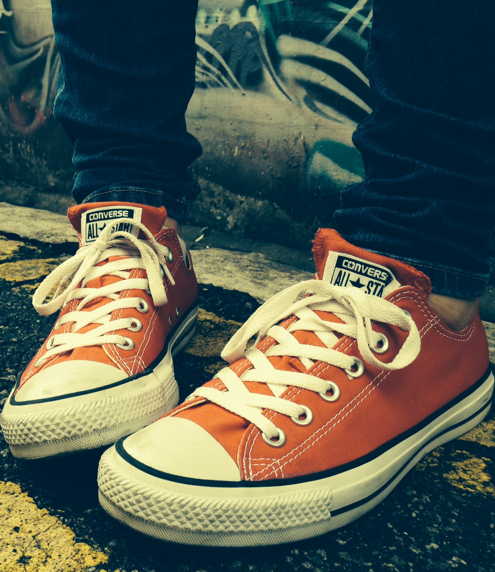 My friend took this photo of my feet on Arab Street in Singapore. I chose this spot for the graffiti art. I staged it to look kind of like a peace wall that still separates a predominantly Catholic and Protestant community in Belfast. Also, Fiona wears red Converse the entire novel. I arranged my feet in a way that I thought suggested anxiety or insecurity.
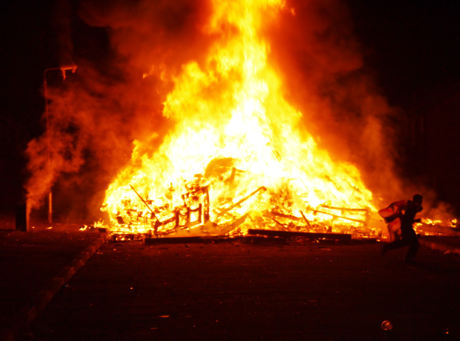 This is a picture I took at a bonfire on Eleventh Night in a Protestant neighborhood in Belfast. This represents Danny’s side of the story and perhaps is more closely related to the title of the novel.
I don’t have Photoshop or any fancy photo-editing software, so I used this free website to do some photo-editing Windows Live Photo Gallery couldn’t do. Then I used this free website to add text, mostly because I liked one of the text options. There may be better sites out there. If there are, please let me know 🙂
Here’s what I came up with so far….
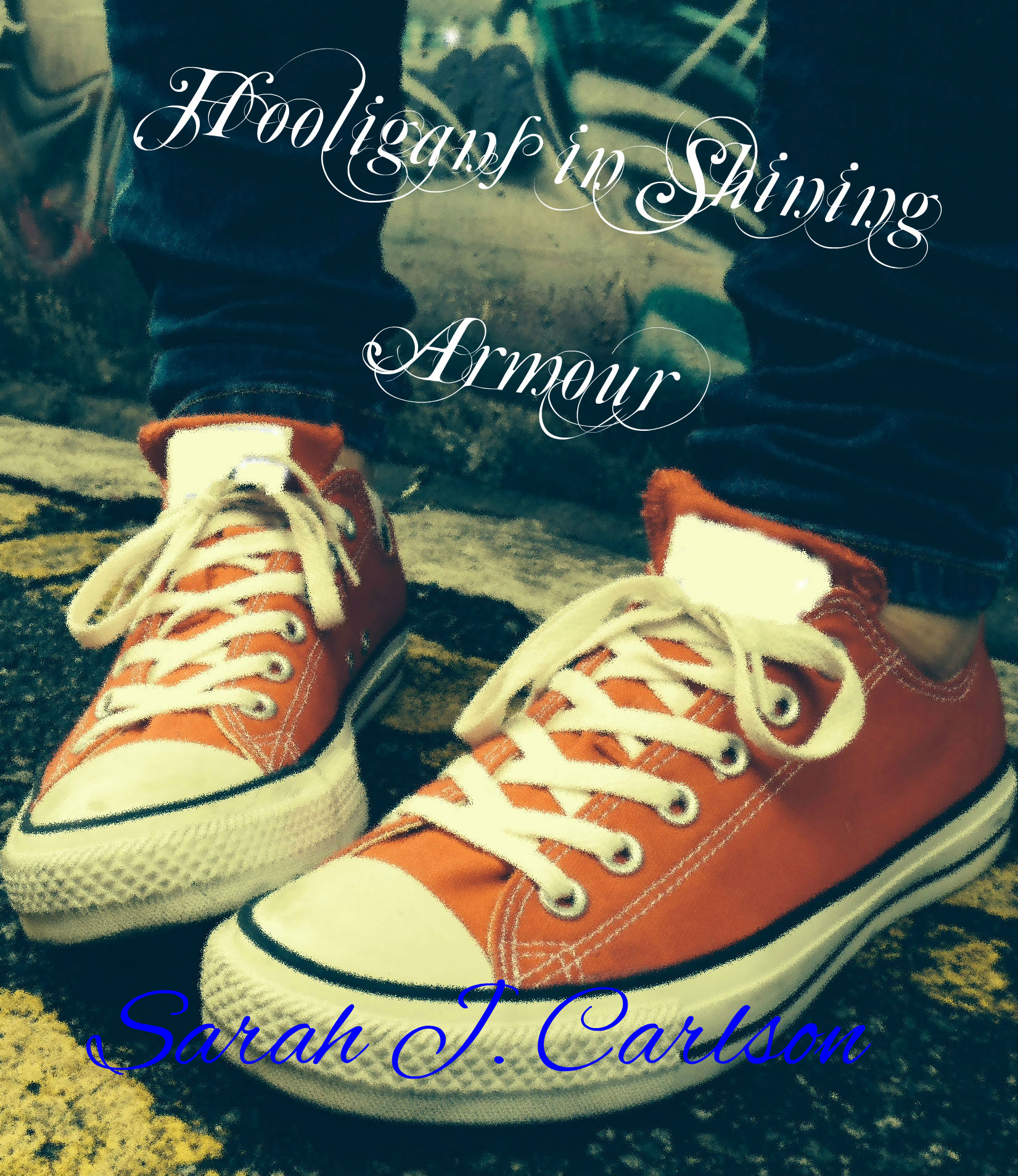 For this one, I tried to blur out the Converse logo but I’m not happy with the color. It’s too bright white, but it was really hard to even get that color.
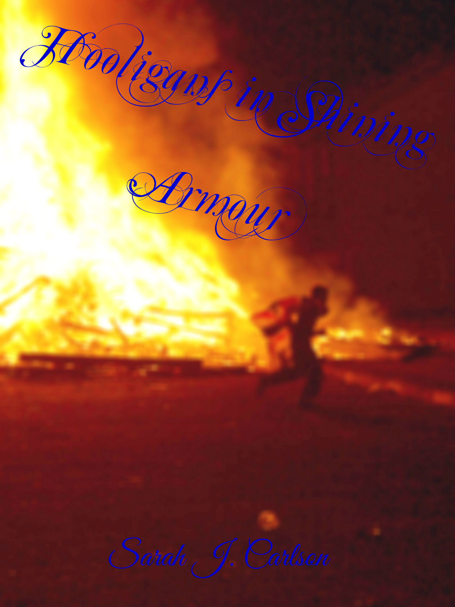 For this one, I enhanced the color a bit and intentionally blurred the photo.
Anyway, this was just for fun. I’m not sure about the font or the color of the font at this point.
Any suggestions for improvement? Knowing very little about my WIP, which do you like better? If you’ve self-published, how have you gone about getting a cover?

I’d vote for the shoe picture, I think it has better depth. When I self e-published, I didn’t bother with a cover (just a grey page with black title text) since I wasn’t sure I could get it right.
LikeLike
Hey, thanks for the vote! I suppose a bad or poorly formatted cover’s the worst 🙂 happy writing!
LikeLike
The one based on Danny’s story doesn’t pop with the color of the graphics. The blue disappears into the background so the eye is hunting for the title and author. I really love the picture for Fiona’s side of the story and it seems to fit the overall theme from what you have said on here before. In the end it is always the emotion that gets you as a reader, and that unfortunately is deemed to be in the female perspective. The anger and disparity between the two cultures really shows in the fire cover though. I would definitely change the font color on that one though.
LikeLike
Great advice about the font and thanks for the thoughtful response 😀 You definitely sussed out my own thoughts on this.
LikeLike
Glad I could help.
LikeLike
shrink them down on your screen to the same size as the thumbnail photos on amazon. That is what most people will see at first.
LikeLike
Ahhh!!!!! Great advice!
LikeLike
I think I stole the idea from somewhere but can’t remember where.
LikeLike
This is really interesting. In my working novel, one of the characters has written a memoir. The cover of the memoir feature blue All Stars (covered with mud and blood splatters). A lot of symbolism in the sneakers.
The sneaker cover suggests a more personal, intimate story. The fire and running figure suggests high-stakes drama. They will attract different readers. Which story is yours?
LikeLike
Hmmmmmm a bit of both, but definitely more personal/intimate. I never really thought of it that way, thanks! So helpful!
LikeLike
I think both are great (with adjustment to font colours to enhance visibility), but perhaps there might be something about markets that’s worth further consideration? The sneakers might appeal to your US readers, but I wonder (no, I actually think!) the bonfires will strike more immediate resonance with your UK market (particularly your readers in Northern Ireland, where the bonfires have such traditional importance). Maybe different covers for the different markets? Just a thought, and all the best with things from here on in.
LikeLike
Great advice! I never really thought of it that way. Yeah, US markets wouldn’t pick up on the meaning of the bonfire one if they walked past it.
I think you’re spot on, too, about considerations for a UK audience.
Interesting to think, too, that the different markets may relate differently to the different characters. Especially the US market who will be a bit baffled by Danny I think.
Great advice, thanks! And all the best to you as well 🙂
LikeLike
I like the one with the shoes, the colouring is a bit more to my liking. But that’s just a personal thing! 😀
LikeLike
Thanks for the input! That’s the kind of stuff that draws potential future readers in though!
LikeLike
The shoes make more of an impression, but the script throws me off. Since covers are one of the most important tools to new writers, I suggest getting an opinion from a designer. Might be a little out of pocket, but ask for Amanda here: http://pixelmischiefdesign.com/ sometimes she will show you a mockup of an idea before you get started.
LikeLike
Great! Thanks for the resource! Happy writing 🙂
LikeLike
The shoe one is better, but the dimensions are off. It’s a little more square-ish rather than rectangular.
Also, the color of the text is not in your or the book’s best interest. The white’s okay (but the text should be bigger and with less space between the top row and second row of text, i.e. the rest of the title and “armour”), but the glaring purple for the author name screams “no idea what I’m doing haaalp.”
I know black and white are both out of the question due to the background, so try messing with the tone and hue of the background a bit to heighten the contrast, so you might be able to use black, white or grey instead.
If that’s not feasible, try straightening out the text, moving the author name up under the title (with the title being bigger, of course, to distinguish) and maybe going from there.
LikeLike
Or, if you move the author name up by the title, you could angle it in the opposite direction to give some contrast.
LikeLike
One more idea, promise I’m done after this: since you have such contrast with the words of the title – i.e. “hooligans” being a word with rougher connotations and “armour” having more refined implications – consider a change of font for them. Maybe “Hooligans” or “Hooligans in” can be a blocky, stocky font while “Shining Armour” can keep their svelte, curlicued font.
Also gives you an option of what font to make your author name, either the rough one or the smooth one, to help set it apart from the background and the title.
Nnk done meow!
LikeLike
Wow you’re like a pro at this! I should hire you to do my cover if I do self-publishing 😉 Thanks so much. Oh, and also, you’re awesome. I’m still contemplating that whole video blog thing, too, Ms. Inspiration 😛
LikeLike
I do what I can!
LikeLiked by 1 person
Great advice! Wow, thanks!
LikeLike
I vote for the shoe one, but the font would probably be hard to read in thumbnail size if it showed up on amazon. 🙂
LikeLike
Good point! I’ll have to play around with that. Thanks for the vote!
LikeLike
I like the shoe one better, but I agree with what others have said about the font. I’d say the title needs to be bolder, and the name needs to be a different color, or possibly in a different place. It’s hard to have it at the bottom there because it’s crossing some sharply contrasting colors, so you’ll have a hard time finding a color that works well with both the dark cement and the light shoes.
LikeLike
Yeah.. that’s what I found and that website didn’t allow you to outline the letters. Maybe I could tone the color back in the original picture I’m thinking…. If that was a bit duller, it’d be easier to get the contrast with the letters. Hm……
LikeLike
Oh and thanks for the vote and the advice!!
LikeLike
I’d definitely go with the shoe cover. And yes, I, too, have a tendency to judge by covers, unless it’s a classic that I love that comes in a boring package. I agree with the above commenters about changing the font, so I don’t think there’s much else I can add.
But what a cool idea!! I’ve never thought to play around with imaginary covers. I might have to try that, myself!
LikeLike
Yeah, it’s been really fun! It’s also got me thinking about different target audiences and what would appeal to each and really how much meaning can be behind the cover and how it connects to the title and theme and all that. All while needing to be attention-grabbing! Such an art, really haha.
Thanks for the vote!!
LikeLike
I like the show cover and I like the don’t but I would take it off the slant
LikeLike
Great! Thanks for the vote and the suggestions 😀
LikeLike
I would definitely go for the shoe cover. But change the font – I agree with many of the comments on that. I think white text would work – also for author’s name, but the fonts could be different, and the title needs to be more prominent than your name.
(Is there any way you can incorporate the bonfire theme into the shoe cover? Is the girl ever in contact with riots/fires? Are her shoes scorched or slightly blackened at any point?)
LikeLike
Nina, sorry for the delay and thanks for the response! Font change it is! I’ll think on combining the two. Great advice and thanks for stopping by!
LikeLike